One of the commonly used methods to make your visitors stay longer and also to increase the page views (plus to decrease bounce rate) on your blog is by adding a list of related posts to the end of each of your blog articles, which makes it easy for the visitors to find the relevant articles to the one that they’re reading.
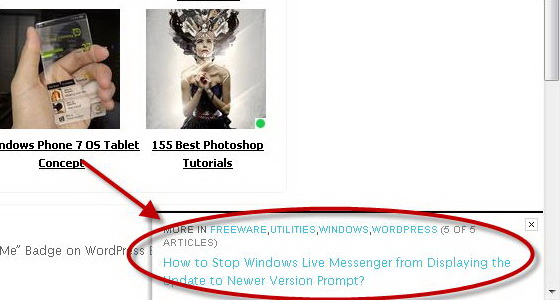
Recently, there is another method that is gaining popularity on the blogosphere, that is by automatically displays a “Next Post” animated box at the bottom right corner of a particular blog article when a visitor scrolls to the bottom of that article.

This feature is first implemented in the New York Times’s website and is brought to WordPress as a WordPress extension, known as upPrev: NYTimes Style “Next Post” Animated Button.
When a visitor scrolls to the bottom of a single article post on your blog, a rectangle box animates in the page’s bottom right corner, allowing the visitor to select the next available post from the same category as the article that they read. If there is no post from the same category exists, then no button will be displayed.
After the extension has been activated, go to the extension’s Settings page. In the settings page, you can choose the animation style between flyout and fade in/out, to slide out the next post box.
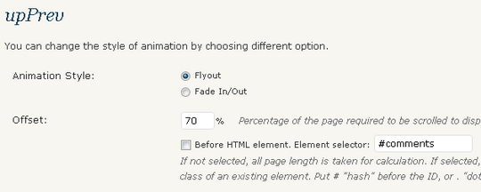
Plus, you can set the percentage of the page required to be scrolled to display the next post box. This option is good because normally visitors will stop scrolling the article at the comment section. Besides that, you can set the box to slide out before a HTML element. Normally, you will want the box to appear just before the comment section.
Download upPrev: NYTimes Style “Next Post” Animated Button WordPress extension


